
Possibility by Amanda Pink
11:00Hi Everyone,
As I still had my designer papers to hand from last weeks project (see here) I thought I'd look to using them in the project I'm sharing today.
This time the designed paper serves as a background for a textured That's Crafty! mandala stencil. Rather than go for a colourful mandala with crisp lines the paper I decided to go with a more neutral, dare I say 'dirty' colour palette so the finished card/ journo page would have a vintage, distressed kinda grungy feel/ look

The paper I chose to work with was from 13Arts 'Grungy Walls' paper pad.

Although the paper is a good quality thickness (200gsm) I knew I would be using a fairly 'wet' medium on it so I adhered it to a piece of card for improved thickness and durability.
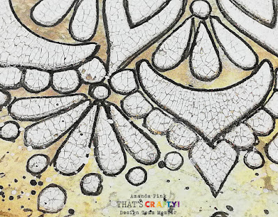
To create the central mandala design I applied Seth Apters 'Crackled' Izink Texture through That's Crafty's 'Magnificent Mandala' stencil.
Seth's 'Crackled' texture is a good consistency to use with a stencil - not too thick, not too loose. As with all crackle mediums it doesn't really like being overworked so I applied it through one area of the stencil design at a time. I didn't go with too heavy an application of the medium as I only wanted fine cracks.
Initially I set the paper to one side to let the crackles form gradually but did finish the process with a heat gun. Unlike some crackle mediums that don't necessarily react well to the heat from a heat gun this particular one didn't seemed to mind as it still produced some lovely crackles.
I used black ink and gold wax very lightly to enhance the fine crackles and then outlined the whole design with a black micron pen.
Small elements of the stencil design were carried through to each of the corners of the designer paper too.

For a touch of additional background detail I added some stamping.
For this I used a couple of stamps from Melina Dahl 's 'Funky Flowers 1' That's Crafty! stamp set with Tim Holtz Distress Archival ink. There was some black and white paint splattered around and I blended some Distress ink around the sides of the paper too just to enrich its colour a touch.

After matt n layering the stencilled paper the addition of a single word provided the finishing touch for the card/ journo page/
'Possibility'

Products used:
Tim Holtz Distress Ink: Vintage Photo
13Arts A5 Stickers: 'On the Wall- Tiny Text' (o/s but similar can be found (here)
Paper Trimmer
I hope you have enjoyed your time here today. Thanks for stopping by.
Hope you have a lovely creative week
Take Care
Amanda
x


0 comments
Thank you for taking the time to leave a comment on our blog, we really appreciate it.
Note: only a member of this blog may post a comment.